|
>>
|
No. 346
[Edit]
File
129941440473.jpg
- (1.88MB
, 2449x3000
, Hidamari_081.jpg
)
Sorry it took me so long to reply.
>>339
>that page seems like standard colouring, not sure why you like it so much
You might be right but I think there are a few things that make it much better than 'standard' coloring.
First of all we have the colors themselves. They are muted and thanks to it they look very ... well, realistic? The pallete that is usually used to color manga is much brighter and it sometimes just looks out of place (from what I've seen of course).
The other things that usually don't look very well in colored manga are highlights and shadowing. Again, both look great in these 4 koma. I feel that usually the attention to detail is traded for color but you've got both here - what's not to love?
>Also, I think there are a select few mangaka whose works just won't have the same charm if coloured.
That goes without saying, really. Since manga is black and white some (or to be more precise - good) mangaka develop style that benefits from it.
>>341
Good example. It's not that they have done poor job with the adaptation. Rather than that it was probably impossible to adapt this art style in the first place. There are lots of other examples.
Then again, it's not always the case, even if you'd think it is. I was 100% certain that Matsumoto Taiyo's style would be lost in trasition but Tekkon Kinkreet's adaptation proved me wrong. The movie managed to do what I deemed to be impossible: it didn't lose the Matsumoto-touch and overall feel and just plain looked good.
>>342
That reminds me, 20th Century Boys also had some colored pages. If I recall correctly they looked pretty bad. Same goes for other manga drawn by Urasawa (for example Pluto). This is another example of a manga where coloring itself is not the issue, it's the quality of coloring that's the real problem. I (vaguely) recall it as downright sloppy.
>>342
>On the other hand, playful stuff like One Piece, Jojo, Yotsuba, or pic related are fucking awesome when coloured.
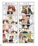
I wonder if there really is a corelation between genre and coloring. As you mentioned, serious, complex manga might be better left alone while cheerful slice of life series might benefit from coloring. The calm, muted colors do a very good job of capturing the 'Hidamari Sketch spirit'. To be perfectly honest I think SHAFT has overdone the 'colorfulness' in Hoshimittsu (i.e. it was too bright). //Fortunately, my laptop is really, really old (so old that I can forget about trying to watch high quality rips) and the backlighting doesn't work anymore. Thanks to it, it didn't bother me that much.//
Now I kinda want to see a colored chapter of Yotsubato! (properly colored).
>>344
>I don't think color is inherently better or worse than black and white.
The thing is that's what I used to belive. I've seen so many examples of bad coloring that I just began to believe that there's no way it can be done right.
>For me, though, B&W drawings occupy a higher plane of being. The lack of color results in a focus on the other aspects of the drawing: the linework, the composition, etc. Things are somewhat abstracted from reality, and intensified.
Exactly my opinion. It takes much more skill to draw something that plain looks good if you don't use colors, as all your technical shortcomings are mercilessly exposed.
>>343
>Great thread topic by the way. This is making me realize I have opinions about things I hadn't even considered before. I'm going to be mulling over this subject for awhile now.
Thanks. For a few weeks I also wanted to create another thread about music that goes well with manga but I'm a lazy man and it will probably take a longer while.
|